Brand kit
The mark
and the artwork
The marks of the Ente and its three festivals, to download, with the rules for using them.
All the marks, the images for social media and the little faces; the animations one by one, below. On WhatsApp, send the files as a Document, not as a photo: they keep their quality and transparency.
The identity
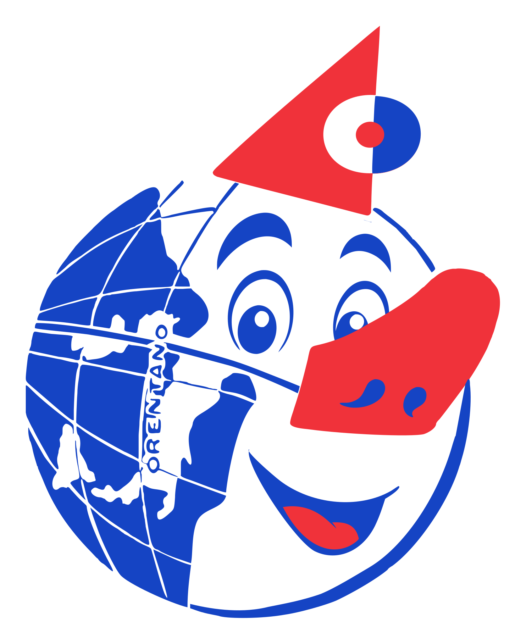
The globe with the cone hat and the red nose, and the name in the posters’ condensed capitals, in blue and red.
For everything that is the Carnevale’s: posters, the programme, social media.
Download

With the name, in colour
On white, on the paper and on light grounds.

With the name, in white
On blue, on coloured grounds and on photos: the globe in the white circle, the name in white.
The globe on its own
Full colour
On white or a light background, cream included. The PNG has a transparent background.
Square on white
For chats and posts: it stays clean even when WhatsApp compresses the photo.
In the white circle
On blue, red or coloured backgrounds, or on photos.

One colour
For stamps, photocopies and black-and-white print.
How to use it
- On the paper and light grounds, the mark in full colour. On any ground that isn’t light (blue, red, a photo, a coloured T-shirt), the version in the white circle: the white of the face is part of the drawing.
- That white is printed: on a coloured ground the mark has three colours.
- Leave clear space around it at least as tall as the pom-pom, about an eighth of the mark.
- On screen never below 44 px; the word ORENTANO is legible from about 120 px.
- Don’t stretch it, redraw it or change its colours.
- In the mark-with-name files, «di Orentano» is in Carnival red. On the site and in the social media images it is in the darker text red, which reads at small sizes too.
- Give the printer the SVG file: it is a vector and scales up without losing quality.
The colours
-
Orentano blue
#1544C4For text
For The mark, titles, links, buttons, large areas; white text on it.
Never Red straight on it: on blue, red gets a white rule.
-
Carnival red
#F0323ALarge lettering only
For The nose, the hat, the seal’s ribbon, «di Orentano» in the mark, large lettering.
Never For text: red text uses text red.
-
Text red
#C4161EFor text
For The red that writes: eyebrows, labels and, on the site, «di Orentano» in the header.
-
Ink
#14225CFor text
For The text on the Carnevale’s and the Ente’s pages: a night blue, the Ente’s ink.
-
White
#FFFFFFFor text
For The mark’s third ink, not the paper: the globe’s face, the white circle, text on the blue.
The typefaces
Bricolage Grotesque
The name in the mark and the titles: bold, condensed, capitals.
Condensed, it finds the voice of the posters pasted on the village’s walls.
Atkinson Hyperlegible
Everything else: the text, dates, the menu.
Designed for low vision: I, l and 1 apart, O and 0 apart. The programme is read by people over eighty and by children.
Both are on Google Fonts, under the OFL licence: free for T-shirts too.
The little faces
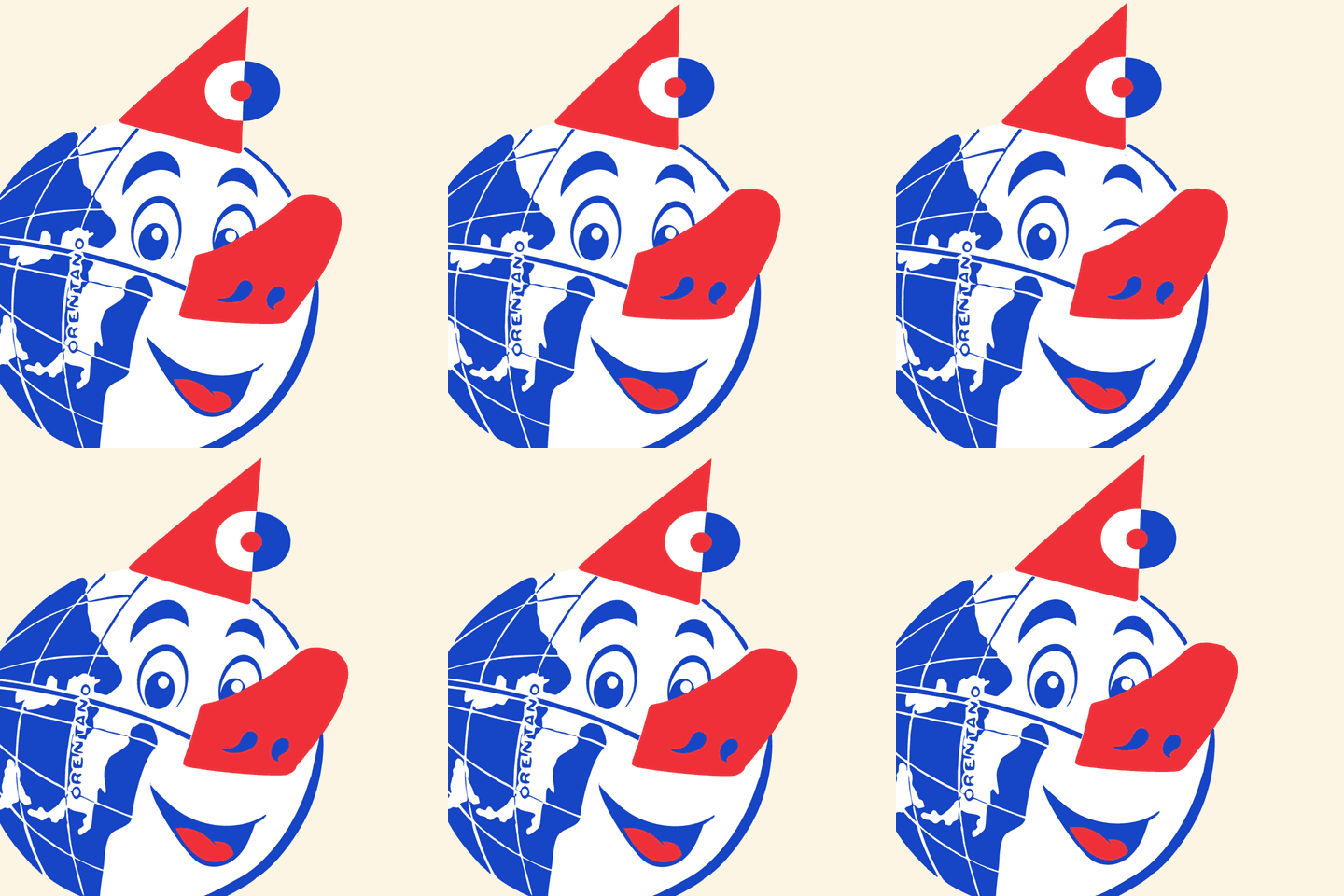
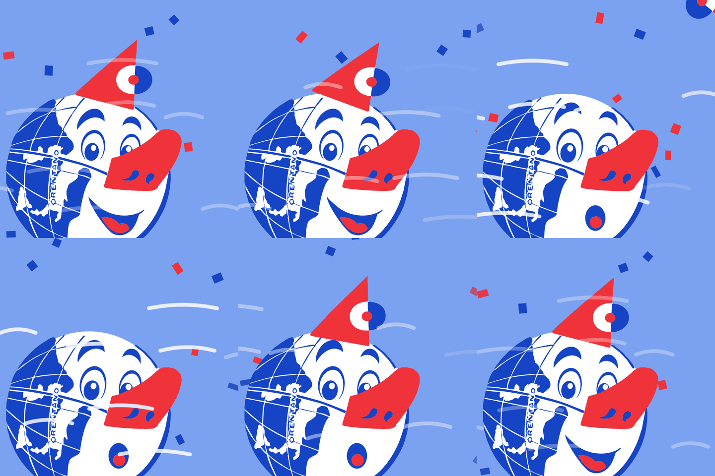
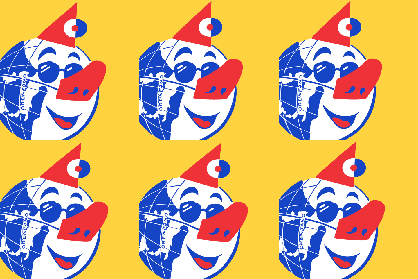
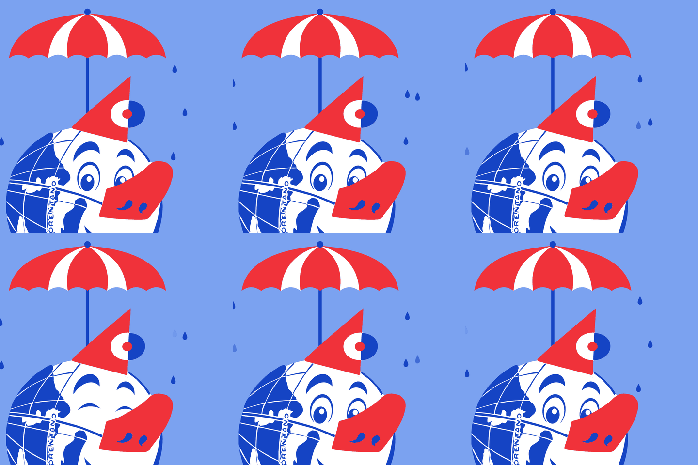
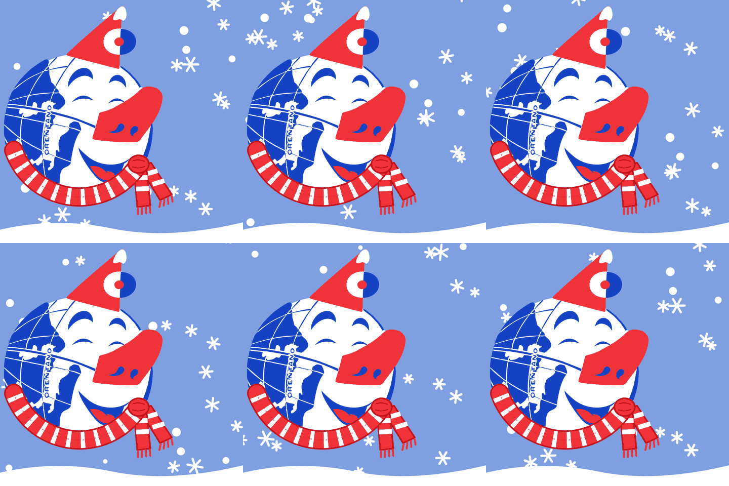
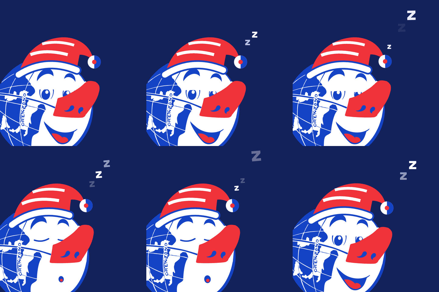
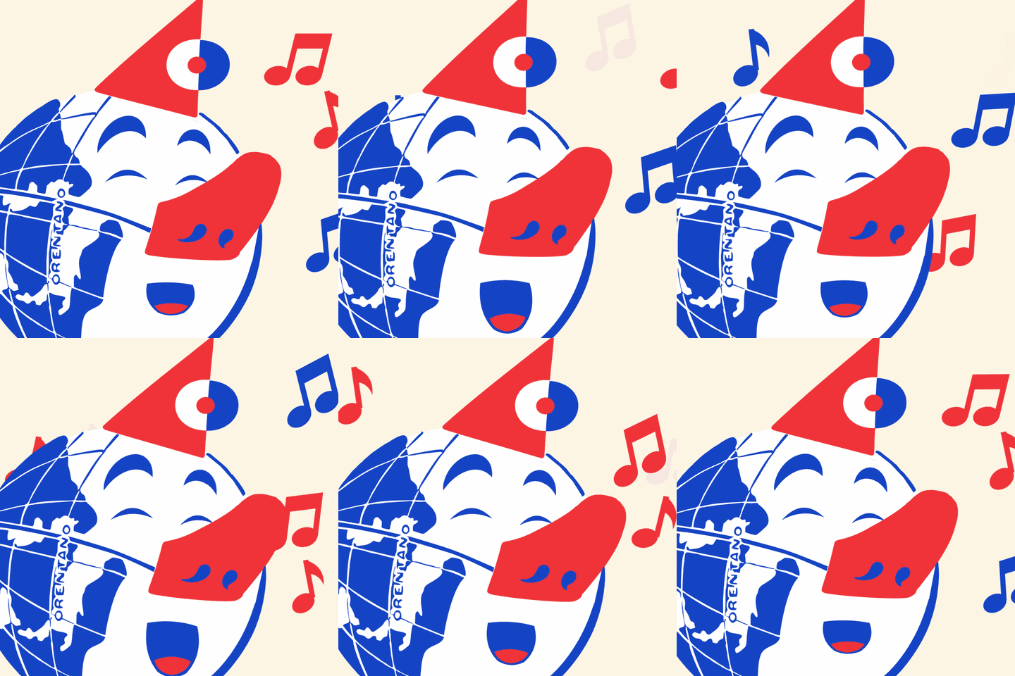
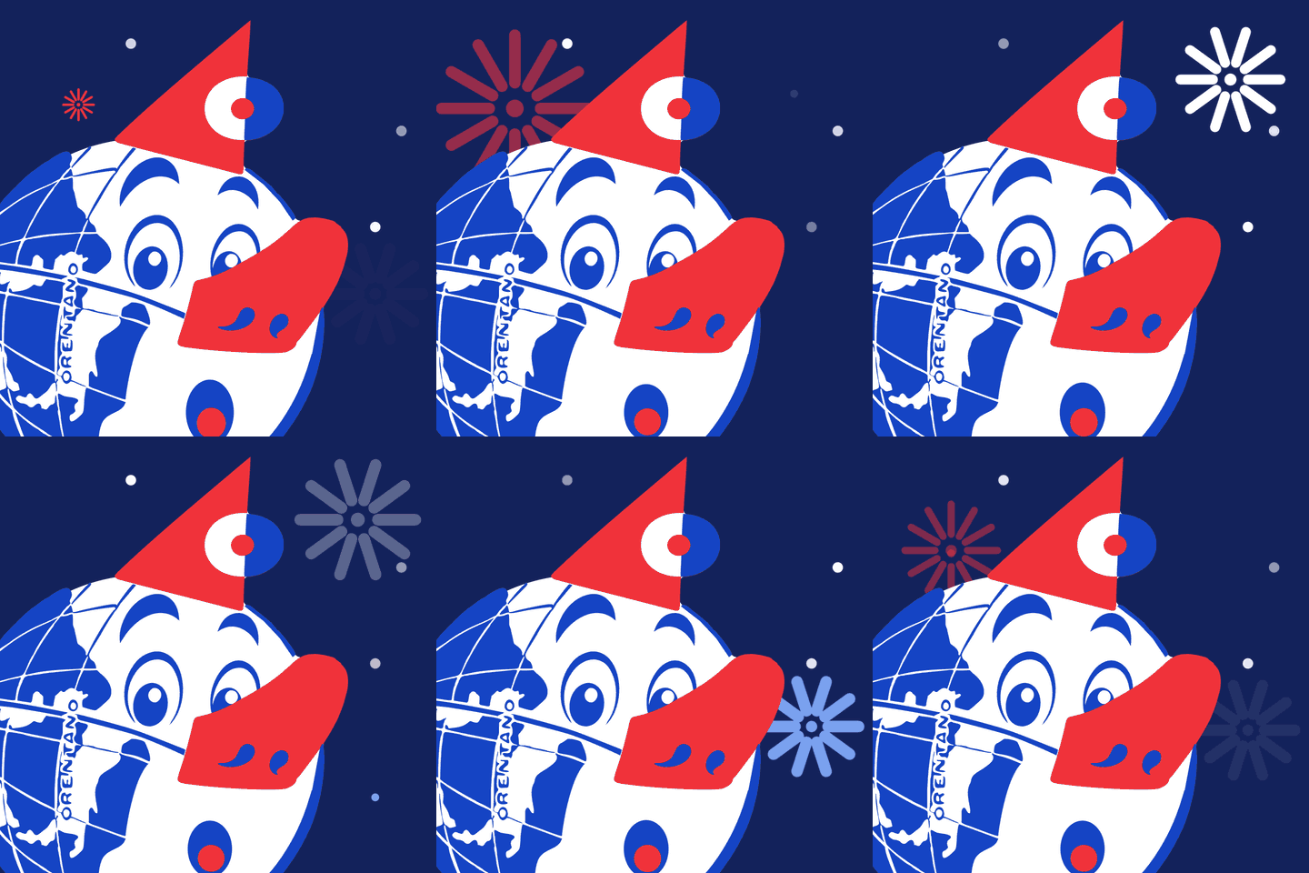
The mark with a few expressions and accessories, for chats and social media. Square PNGs with a transparent background: they sit on any colour.
 Hi! PNG · 78 kB
 Wink PNG · 77 kB
 So happy PNG · 72 kB
 Sunny PNG · 77 kB
 Rainy PNG · 69 kB
 Snowy PNG · 93 kB
 Good night PNG · 67 kB
 With the band PNG · 79 kB
 Windy PNG · 65 kB
 Fireworks PNG · 93 kB


In motion
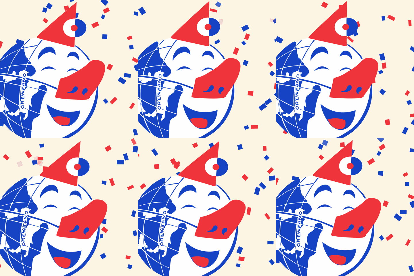
The little faces on a loop, with no sound. The GIF is for chats; the MP4 is square and high quality, for posts, stories and anywhere that takes an animated profile picture: it crops well to a circle too.
-
Wink
-
Party
-
Boop on the nose
-
Blink
-
Surprise!
-
The hat
-
There goes the hat
-
Sunny
-
Rainy
-
Snowy
-
Good night
-
With the band
-
Fireworks
The animations
For the 70th edition. Short videos with no sound: add your own music when you post them. Each comes in three formats: square, 4:5 portrait for the feed and 9:16 for stories and reels.
-
The 70 takes off 10 s
-
The programme 19 s
-
Redrawn 10 s
-
Peekaboo 12 s
-
Rolling in 10 s
How to talk about it
- Its full name is «Carnevale dei Bambini di Orentano»: the «di» is never dropped.
- It is the winter carnival: never «Carnevale d’Autunno».
- It has run since 1956, with a few years skipped: 2027 is the 70th edition. Write «70ª edizione» (70th edition) or «since 1956», never «70 years».
- On Sundays, the masked parades with the allegorical floats. Martedì Grasso is not a parade: it is the dinner at the Spazio Feste, with the burning of the Testone and fireworks.
- No tickets: entry is «a offerta libera» (pay what you wish).
- The historic mark is called the Testone, or the original: never «the old logo».
- The mascot has no name yet: say «the mascot».
In Canva and in print
- Start from the files: the mark with its name as a PNG for Canva and Word, as an SVG for the printer. The lettering is already drawn: you don’t need the typeface.
- Setting the name by hand takes Bricolage Grotesque at weight 800, condensed (width 75). We have not yet checked whether Canva has it condensed: until then, use the files.
- In the Canva kit, add the colours by name with their HEX code, as above; the text in Atkinson Hyperlegible, dates and times in bold.
In print, for every festival
- Body text at least 12 pt with 1.5 line spacing: the programmes are read by people over eighty too. Make a large-print version of the programme as well.
- Never red text below 18 pt, never text on a photo without a solid band under it.
- The colours have no Pantone or CMYK values yet: ask the printer for a proof and show it to the Ente.
On the site, for whoever looks after it
- On the Carnevale’s pages the header shows the globe with the Carnevale’s name, in blue and red: it leads to the Carnevale’s page.
- The menu is the same all over the site, Atkinson bold in spaced capitals: here in blue, the current page underlined in red.
- The press-release bar at the top is blue, its title underlined in red.
- The footer is ink, its top rule red; the Ente’s second line and the links under the pointer in light red.
The colours on the site, with their measured contrast
-
Winter sky
--color-carnevale-fondo#D2ECF46.42:1 Orentano blue on it
The ground of the Carnevale’s card, beside the Sagra’s and the Festa’s.
Never As the ground of a whole page: pages stay on the paper.
-
Orentano blue
--color-blu-orentano#1544C47.27:1 on the paper(carries text) 6.42:1 on the card(carries text)
-
Carnival red
--color-rosso-carnevale#F0323A3.70:1 on the paper(titles from 24 px only) 3.26:1 on the card(titles from 24 px only)
-
Text red
--color-rosso-testo#C4161E5.55:1 on the paper(carries text) 4.90:1 on the card(carries text)
-
Ink
--color-inchiostro#14225C13.67:1 on the paper(carries text) 12.06:1 on the card(carries text)
-
White
--color-bianco#FFFFFF7.91:1 on Orentano blue(carries text)
-
Light red
--color-rosso-su-scuro#FF7A805.91:1 on the footer(carries text)
On the footer of the Carnevale’s pages: the Ente’s second line and the links under the pointer.
-
Night blue
--color-blu-hover#0F33999.89:1 on the paper(carries text) 8.72:1 on the card(carries text)
Links, buttons and the press-release bar under the pointer.
-
Quiet
--color-tenue#56607F5.72:1 on the paper(carries text) 5.05:1 on the card(carries text)
Eyebrows, dates and notes.
The identity «Cinque forni» (five ovens)
Sagra della Pizza di Orentano
The Sagra’s sign is its wood-fired ovens, five like those on the Ente’s 2017 page: five ovens with a smoking chimney and fire in the mouth. The colours are the oven’s, light: an apricot ground, dark ember for the name, charcoal for the text.
For everything that is the Sagra’s: posters, flyers, social media.
Download
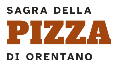
The logotype
On the paper or the apricot ground: never on a photo or a full colour.
How to use it
- Three lines: «Sagra della» small, PIZZA large in the festival’s face, «di Orentano» small. The small lines are in Atkinson Hyperlegible bold, spaced capitals, like the site’s menu.
- PIZZA in dark ember, the small lines in charcoal, always on the paper or the apricot ground: never on a full colour or on a photo.
- The globe never goes in the logotype. Under it, where needed, the line «Un evento dell’Ente…».
- If the beer went into the name, only the small line would change: PIZZA stays the large word.
Yes
- The light apricot ground, and the Ente’s paper for long pages.
- PIZZA and the headings in Alfa Slab One, from 24 px up.
- Dates, times and prices in Atkinson Hyperlegible bold.
- The five ovens with chimney, fire and wood.
No
- Alfa Slab One for text, the menu or dates.
- Ember or flame for text.
- Full or dark grounds: charcoal, brick, full orange.
- The globe inside the logotype.
- The Carnevale’s red and blue, and Bricolage Grotesque: they are the Carnevale’s and the Ente’s.
The colours
-
Apricot
#F9D9BEGround
For The festival’s ground: cards, the date tag, posts, flyers.
Never Darker or full; under a long text, which goes on the paper.
-
Dark ember
#A3450EFor text
For PIZZA and the titles; it carries text too.
Never As the ground of large areas.
-
Burnt ember
#8F3B0BFor text
For Links and dates; on the site, the press-release bar under the pointer.
-
Charcoal
#262321For text
For The text and the logotype’s small lines.
Never Black: charcoal instead. Charcoal as a full ground.
-
Ember
#DC5F14Decoration only
For The ovens’ domes, rules.
Never For text, titles included: beside the Carnevale’s red, for people who confuse red and green it is the same colour.
-
Flame
#FFA552Decoration only
For The embers in the ovens’ mouths, underlines.
Never For text on the paper or the apricot: it cannot be read.
The typefaces
Alfa Slab One
ÀÈÉÌÒÙ àèéìòù ª – € 0123456789
The title: PIZZA in the logotype and the headings.
A heavy slab serif, like the wood type of oven signs and fair posters: «Sagra della Pizza» fits on one line even on a phone. From 24 px up (only the name in the site’s header goes down to 16 px); never for text, the menu or dates.
Atkinson Hyperlegible
ÀÈÉÌÒÙ àèéìòù ª – € 1968 1984 2027
Everything else: the text; dates and times, in bold; the logotype’s small lines, in spaced capitals.
The same as the Ente’s and the Carnevale’s: designed for low vision, with I, l and 1 clearly apart.
The motif
Five wood-fired ovens in a row: the low dome, fire in the mouth, the chimney to one side with its smoke, wood underneath. These signs say «wood-fired oven»: without them a dome reads as a door or a tombstone. Always in whole groups of five, never four. They run along an edge, at the foot of a post or under a title; a single oven is the icon.
How to talk about it
- It has run since 1984, in summer, in June and July, at the Spazio Feste.
- The Ente’s 2017 page speaks of five wood-fired ovens and 200–250 pizzas an evening: ask the Ente whether that still holds before writing it in the present tense.
- The «Pizza orentanese» has been on Tuscany’s list of traditional food products since 2024.
- The site writes «Sagra della Pizza»: whether the beer goes into the name is for the Ente to decide.
In Canva and in print
- Start from the logotype file, above: the lettering is already drawn, you don’t need the typeface.
- The ovens’ drawing is not a file of its own yet.
- We have not yet checked whether Alfa Slab One is in Canva’s font menu. If it is not, upload the file, which is free (OFL licence): that needs a Canva Pro, Teams or Nonprofit account.
- In the Canva kit, add the colours by name with their HEX code, as above, and write the rules beside them: text only in charcoal or dark ember, dates in Atkinson.
- The apricot ground is light and cheap to print; on a photocopy it can go, leaving the white paper.
In print, for every festival
- Body text at least 12 pt with 1.5 line spacing: the programmes are read by people over eighty too. Make a large-print version of the programme as well.
- Never red text below 18 pt, never text on a photo without a solid band under it.
- The colours have no Pantone or CMYK values yet: ask the printer for a proof and show it to the Ente.
On the site, for whoever looks after it
- On the Sagra’s pages the header stays on the paper and shows the name only, «Sagra della Pizza» in Alfa Slab One with «di Orentano» small under it: no globe. The name leads to the Sagra’s page.
- The menu is the same all over the site, Atkinson bold in spaced capitals, here in the Sagra’s colours.
- The press-release bar at the top turns dark ember, its title underlined in flame. The colour is the page’s, not the release’s: that is why the bar names the festival.
- The footer, dark for the Ente already, turns charcoal: the Sagra’s only dark ground, and only on the site. Its top rule is ember; the Ente’s second line and the links under the pointer in flame.
The colours on the site, with their measured contrast
-
Apricot
--color-pizza-fondo#F9D9BE11.67:1 Charcoal on it
-
Dark ember
--color-pizza-titoli#A3450E5.66:1 on the paper(carries text) 4.60:1 on the ground(carries text)
-
Burnt ember
--color-pizza-link#8F3B0B6.90:1 on the paper(carries text) 5.61:1 on the ground(carries text)
-
Charcoal
--color-pizza-inchiostro#26232114.37:1 on the paper(carries text) 11.67:1 on the ground(carries text)
-
Ember
--color-pizza-brace#DC5F143.40:1 on the paper(titles from 24 px only) 2.76:1 on the ground(decoration only)
-
Flame
--color-pizza-fiamma#FFA5521.80:1 on the paper(decoration only) 1.46:1 on the ground(decoration only) 8.00:1 on the footer(carries text)
The identity «Cielo di San Lorenzo» (San Lorenzo’s sky)
Festa del Bignè di Orentano
The patron saint’s feast, in August, when the sky is still light at dusk. The ground is a soft wisteria, BIGNÈ is in plum, and the falling stars all have the grave accent’s slant: the right accent of BIGNÈ becomes the sign.
For everything that is the Festa’s: posters, flyers, social media.
Download
The logotype
On the paper or the wisteria ground: never on a photo or a full colour.
How to use it
- Three lines: «Festa del» small, BIGNÈ large in the festival’s face, «di Orentano» small. The small lines are in Atkinson Hyperlegible bold, spaced capitals, like the site’s menu.
- BIGNÈ with the grave accent. The festival’s face has the right È: never BIGNÉ.
- The globe never goes in the logotype. Under it, where needed, the line «Un evento dell’Ente…».
- If the name became «Sagra del Bignè», only the small line would change: BIGNÈ stays the large word.
Yes
- The light wisteria ground, and the Ente’s paper for long pages.
- BIGNÈ and the headings in Caprasimo, from 24 px up, with the grave accent.
- Dates, times and prices in Atkinson Hyperlegible bold.
- The stars, all at the same slant, and here and there a bignè.
No
- Caprasimo for text, the menu or dates.
- Gold for text.
- Full or dark grounds: night, full purple.
- The globe inside the logotype.
- BIGNÉ with the acute accent.
- The Carnevale’s red and blue, and Bricolage Grotesque: they are the Carnevale’s and the Ente’s.
The colours
-
Wisteria
#E7DFF4Ground
For The festival’s ground: cards, the date tag, posts, flyers.
Never Darker or full; under a long text, which goes on the paper.
-
Plum
#3D1030For text
For BIGNÈ, the titles, the text and the small lines.
Never As the ground of large areas: it is nearly black.
-
Raspberry
#A0136AFor text
For Links and dates.
Never For BIGNÈ: the name is in plum.
-
Gold
#D9A520Decoration only
For The stars, rules.
Never For text: on the paper it cannot be read.
The typefaces
Caprasimo
ÀÈÉÌÒÙ àèéìòù ª – € 0123456789
The title: BIGNÈ in the logotype and the headings.
A soft, heavy serif, with the full bellies and round serifs of a choux bun. The accent of its È rises above the capitals: the line needs a line height of at least 1.1. From 24 px up (only the name in the site’s header goes down to 16 px); never for text, the menu or dates.
Atkinson Hyperlegible
ÀÈÉÌÒÙ àèéìòù ª – € 1968 1984 2027
Everything else: the text; dates and times, in bold; the logotype’s small lines, in spaced capitals.
The same as the Ente’s and the Carnevale’s: designed for low vision, with I, l and 1 clearly apart.
The motif
Falling stars, all at the grave accent’s slant: that rule makes them one family rather than clip-art. Few, scattered in a corner or along an edge, never under the text. Now and then, resting at the foot, a bignè with sugar on top.
How to talk about it
- In August, for San Lorenzo, the patron saint. Since 1968 it has been the feast of Orentano’s pastry chefs, and since 1987 there has been the «Dolcione».
- It takes place in the village, within a week of celebrations with entertainment every evening, known in Orentano as the «Agosto Orentanese».
- «Bignè» takes the grave accent: bignè, BIGNÈ. Never «bigné».
- The site writes «Festa del Bignè»: the name is still for the Ente to decide.
- The «Bignè di Orentano» has been on Tuscany’s list of traditional food products since 2024.
In Canva and in print
- Start from the logotype file, above: the lettering is already drawn, you don’t need the typeface.
- The stars’ drawing is not a file of its own yet.
- We have not yet checked whether Caprasimo is in Canva’s font menu. If it is not, upload the file, which is free (OFL licence): that needs a Canva Pro, Teams or Nonprofit account.
- In the Canva kit, add the colours by name with their HEX code, as above, and write the rules beside them: text only in plum, dates in Atkinson, gold only for the stars.
- Light wisteria tends to grey in four-colour print: test it on paper before the run.
In print, for every festival
- Body text at least 12 pt with 1.5 line spacing: the programmes are read by people over eighty too. Make a large-print version of the programme as well.
- Never red text below 18 pt, never text on a photo without a solid band under it.
- The colours have no Pantone or CMYK values yet: ask the printer for a proof and show it to the Ente.
On the site, for whoever looks after it
- On the Festa’s pages the header stays on the paper and shows the name only, «Festa del Bignè» in Caprasimo with «di Orentano» small under it: no globe. The name leads to the Festa’s page.
- The menu is the same all over the site, Atkinson bold in spaced capitals, here in the Festa’s colours.
- The press-release bar at the top turns plum, its title underlined in light gold. The colour is the page’s, not the release’s: that is why the bar names the festival.
- The footer, dark for the Ente already, turns plum: the Festa’s only dark ground, and only on the site. Its top rule is gold; the Ente’s second line and the links under the pointer in light gold.
The colours on the site, with their measured contrast
-
Wisteria
--color-bigne-fondo#E7DFF412.36:1 Plum on it
-
Plum
--color-bigne-titoli#3D103014.69:1 on the paper(carries text) 12.36:1 on the ground(carries text)
-
Raspberry
--color-bigne-link#A0136A6.91:1 on the paper(carries text) 5.82:1 on the ground(carries text)
-
Gold
--color-bigne-oro#D9A5202.07:1 on the paper(decoration only) 1.74:1 on the ground(decoration only)
-
Light gold
--color-bigne-oro-chiaro#F2C14E9.51:1 on the footer(carries text)
On plum: the underline in the press-release bar and, in the footer, the Ente’s second line and the links under the pointer.
Never On the paper or on wisteria.
-
Dark plum
--color-bigne-hover#5A1A4711.55:1 on the paper(carries text) 9.72:1 on the ground(carries text)
The press-release bar under the pointer.
The identity
The pages that belong to all three festivals (the Ente’s page, the press releases, the notifications, this kit) are the Ente’s: paper and ink, the night blue the site writes with. Each festival adds its own colour.
For the Ente’s own things: press releases, documents, signatures, the site’s footer.
Download

With the name, in colour
On white, on the paper and on light grounds: press releases, documents, signatures.

With the name, in white
On dark grounds and on photos: the globe in the white circle, the name in white.


The globe on its own, without the name, is in the Carnevale’s tab.
How to use it
- The globe with the Ente’s name on two lines, in Bricolage Grotesque’s condensed capitals.
- On the paper and light grounds the globe is in full colour and the name in blue and red, never in ink: a mark is never recoloured.
- On dark grounds and photos, the globe in the white circle and the name in white.
Yes
- Paper and ink for whatever belongs to all three festivals.
- The festivals’ cards and labels in their colours, on an Ente page too.
No
- The Carnevale’s bright blue and red for the Ente’s titles, links and buttons.
- A festival’s colours on the Ente’s things, outside its card and its label.
- Ink grey for lettering.
The colours
-
Paper
#FCF5E4Ground
For The ground of every page of the site, and of sheets with a lot of text.
-
Darker paper
#F3E9D2Ground
For Boxes and cards on the paper.
-
Ink
#14225CFor text
For The Ente’s titles, text, links and buttons; the footer’s ground on the Ente’s and the Carnevale’s pages.
Never For a festival’s titles, links and buttons: its own colours apply there.
-
Quiet
#56607FFor text
For Eyebrows and dates.
-
Ink grey
#7D87A8Decoration only
For Rules and underlines.
Never For lettering: on the darker paper it does not carry even titles.
The typefaces
Bricolage Grotesque
The Ente’s name in the mark, in blue and red, and its pages’ titles, in ink: bold, condensed, capitals.
The Carnevale’s own; the titles in the Ente’s colour, so the pages belong to the same house.
Atkinson Hyperlegible
Everything else: the text, dates, the menu.
Designed for low vision: I, l and 1 apart, O and 0 apart.
How to talk about it
The Ente is one group: the same people organise three festivals every year. The Carnevale, the Sagra and the Festa are not three associations but three festivals of the same Ente. Say it that way: the Ente organises the Carnevale dei Bambini, the Sagra della Pizza and the Festa del Bignè.
- Its full name is «Ente Carnevale dei Bambini Pro Loco di Orentano APS». Write it in full the first time: in press releases, signatures, documents and beside the mark.
- After the first time, «the Ente» is enough, with a capital E.
- Under a festival’s logotype, where needed, the line «Un evento dell’Ente Carnevale dei Bambini Pro Loco di Orentano» (an event by the Ente): it says who organises it without putting the globe in the festival’s logo.
- When a festival is made with other associations, name them as the flyer does: in 2026 the Sagra and the Festa were with the Gruppo Scout Orentano and the Filarmonica Leone Lotti.
How to write it
- The three festivals together, in the order of the year: the Carnevale dei Bambini, the Sagra della Pizza, the Festa del Bignè. The names stay in Italian.
- Editions with the ª: «70ª edizione». Never «70a», «70^» or «56°».
- Years with an en dash: 1956–2027.
- Dates and times in full: «Sunday 24 January 2027», «from 2:30 pm».
- Write an edition number only once the Ente confirms it.
The tone
- Orentano is a real Tuscan village: tell it warmly and plainly, without superlatives.
- Every fact has a source: the 1980 book, the Ente’s page, the Region, the flyers. If a fact is missing, ask the Ente: never write a likely-sounding sentence.
- What the Ente has still to say stays a gap, «to be confirmed».
- Don’t inflate: the rioni are not an old tradition (La Sughera was founded in 2026) and Orentano has no palio.
- No emoji in titles or buttons.
In Canva and in print
- Start from the mark-with-name files: the lettering is already drawn.
- For the Ente’s pages and press releases, add the paper and the ink to the Canva kit by name with their HEX code, as above; the text in Atkinson Hyperlegible. For documents and letterhead it is still for the Ente to decide.
In print, for every festival
- Body text at least 12 pt with 1.5 line spacing: the programmes are read by people over eighty too. Make a large-print version of the programme as well.
- Never red text below 18 pt, never text on a photo without a solid band under it.
- The colours have no Pantone or CMYK values yet: ask the printer for a proof and show it to the Ente.
On the site, for whoever looks after it
 Ente Carnevale dei Bambini
Pro Loco di Orentano APS
 Ente Carnevale dei Bambini
Pro Loco di Orentano APS
- The Ente’s pages: «The Ente», the press releases and their lists, the notifications, this kit, the error pages.
- Titles, links, buttons and the press-release bar in ink; eyebrows and dates in the quiet colour; rules in ink grey.
- The header: the Ente’s mark, in blue and red, leading to «The Ente» page. The menu is the same on every page of the site, Atkinson bold in spaced capitals: only its colours change.
- The press-release bar takes the page’s colour, not the release’s: that is why it names the festival («Release · Carnevale · 17 October»).
- The footer is the Ente’s on every page: ink on its pages and the Carnevale’s, the festival’s darkest colour on the Sagra’s and the Festa’s. The globe is white, the band showing through its lines, with a thin white line around it so the hat and the nose read: a drawing made for the site only, not in the kit. The name is white, its second line in the page’s light colour.
- On the Ente’s pages the festivals’ cards keep their colours, and the listed press releases carry their festival’s label in its colours.
The colours on the site, with their measured contrast
-
Paper
--color-carta#FCF5E413.67:1 Ink on it
-
Darker paper
--color-carta-scura#F3E9D212.31:1 Ink on it
-
Ink
--color-ente-titoli#14225C13.67:1 on the paper(carries text) 12.31:1 on the darker paper(carries text)
-
Quiet
--color-ente-quando#56607F5.72:1 on the paper(carries text) 5.15:1 on the darker paper(carries text)
-
Ink grey
--color-ente-decoro#7D87A83.27:1 on the paper(titles from 24 px only) 2.95:1 on the darker paper(decoration only)
-
Night ink
--color-ente-hover#0B164016.06:1 on the paper(carries text) 14.46:1 on the darker paper(carries text)
Links and buttons under the pointer.
-
Light ink
--color-ente-su-scuro#B9C1DE8.31:1 on the footer(carries text)
On the footer of the Ente’s pages: the Ente’s second line and the links under the pointer.
For social media
Three designs for each format: carta (paper), blu (blue) and sbirciata (peekaboo). The «always valid» ones carry no dates and no edition number (only «Dal 1956»); the 70th edition ones carry the 2027 dates.
Profile picture 1080 × 1080
The same for YouTube, Facebook and Instagram, and for both versions: it is cropped to a circle.
YouTube
Channel banner 2560 × 1440
Facebook
Page cover 1640 × 624
Event cover 1920 × 1005
Instagram
Square post 1080 × 1080
Portrait post 1080 × 1440
Story 1080 × 1920